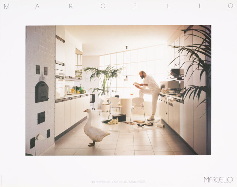
Marcello kitchen (1984)
Furniture factory R. Saarinen wanted to launch a new international kitchen collection. The name Marcello was a reference to southern Europe, as were the kitchen designs. The style was different from the traditional domestic style and the names were of foreign origin. The starting point for the new logo was clear, so the next step was to find a typeface that would fit the style of the kitchen world.
The new logo, as well as the entire look of the Marcello kitchen, is based on the text type ITC Avand Garden, designed by Herb Lubalin in 1970. In the logo, the first letter was emphasised, and the letter A was given a rounded shape to match the style. The logo was approved by the client. Next, I was asked to design new business cards for the company. I remember getting excited about the project by designing cards with a logo in either pastel red or blue, depending on the gender. The cards were printed and delivered.
At the time, Marcello's kitchen was part of the Puolimatka group, which is where the new business cards were sent. I received a phone call from the management of the group, and the definitely did not like the new logo. I was told that the logo was too thin and modest for the kitchen world, and they doubted whether it would work in different sizes and media. Naturally, I promised to look into how the logo could be improved and get back to them as soon as possible.
A total knockout from the customer is always a serious problem. We were working on several Marcello projects: kitchen shootings were in progress, brochures and posters were being designed and well underway. Starting a new logo design seemed more than difficult.
Together with Tapani Luohoranta, we took the Marcello logo back on the table. We felt that the starting point, the style and the form of the logo were right. It was just a matter of bringing in the power and determination that the client was looking for. We did this by redrawing the letters of the logo using two lines of different thicknesses instead of one. We produced a sketch of the improved logo to illustrate how the logo behaves at different sizes on both white and dark backgrounds.
I submitted the material to the group management. Were we able to make the essential changes? The feedback was: the logo is good! We made it! We could continue the work. The brochures, posters and material for the kitchen shop were completed and they got a good reception. However, the staff business cards were not reprinted. The Marcello kitchen brochure and posters were awarded a silver top in the Top of the Year competition.
Designers: Viktor Kaltala, Tapani Luohoranta, Anne Pelkonen
Office: USP Helsinki, 1984


